
Air France Mobile App
PROJECT SUMMARY
PROBLEM
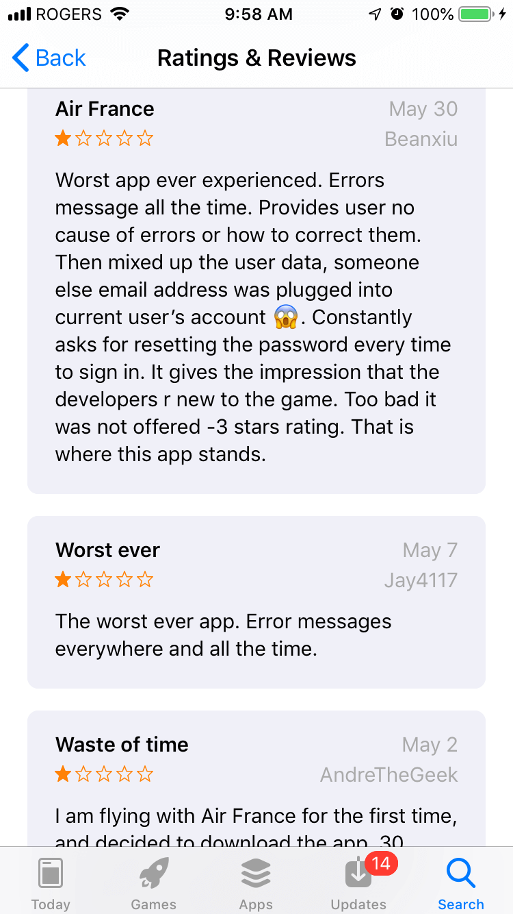
Air France is a global airline carrier with a mobile problem—their mobile app experience is terrible. As of May 2019, their app has a rating of 2.5 (on the iOS store) with users complaining about it being the “worst app ever experienced” which has “error messages all the time [which] provides user no cause of errors or how to correct them”. In order to see if we could address some of the real-user concerns that were not related to technical (i.e. development) issues , my partner and I decided to conduct a heuristics evaluation and redesign on what we believed to be the core offering of the app, the ‘Purchase a Ticket’ experience.
SOLUTION
There were three main areas of focus that we established a redesign would be the most beneficial in order to improve the user experience, specifically: the hierarchy of information, the composition of the elements, and the helpfulness of error messages.
IMPACT & OUTCOMES
As this was an educational class-project, there has not been any real-world impact although we did think it would be interesting to release the designs to Air France to see if they would use them in their actual application.
LEARNINGS
The main takeaway for me was that the usability evaluation portion could have been made less subjective between my partner and I if we created a more precise custom-scoring system (or just used the Neilen Norman scoring system) in addition to having guiding prompts when evaluating each heuristic. The increased subjectivity meant that our scores (out of 5) for each heuristic often resulted in us defending a particular score rather than coming to the same "conclusion".
PROCESS
In order to see our process, please continue reading further below.
ROLE
- Usability Evaluator
- UX/UI Design
TOOLS
- Sketch
- inVision
ESTIMATED READING TIME
14 mins
OVERVIEW
INTRODUCTION
In this partner project, we selected the Air France mobile app as it had a rating of 2.5 on the iOS app store. Countless reviews complained about “error messages everywhere” and that the messages provided users with “no cause of errors or how to correct them”.
We also downloaded the app to informally test it for ourselves, and found that there was much opportunity to improve the experience due many factors including poor user interface design, poor microcopy, and unexpected navigational interactions.
PROJECT GOALS
There were two main goals for this project:
- Perform a heuristic evaluation on a critical task flow to identify usability issues
- Implement design changes for critical task flow according to recommendations from the heuristic evaluation and present redesigns.
HEURISTIC EVALUATION
The reason a heuristic evaluation is important to conduct is because it exposes usability issues that a user may encounter, according to certain rules of thumb. It is typically conducted by at least three usability experts, and while there are more than 200 criteria which can be used to conduct an evaluation, many refer to the 10 Usability Heuristics for User Interface Design by Jakob Neilsen.
HEURISTICS SELECTED
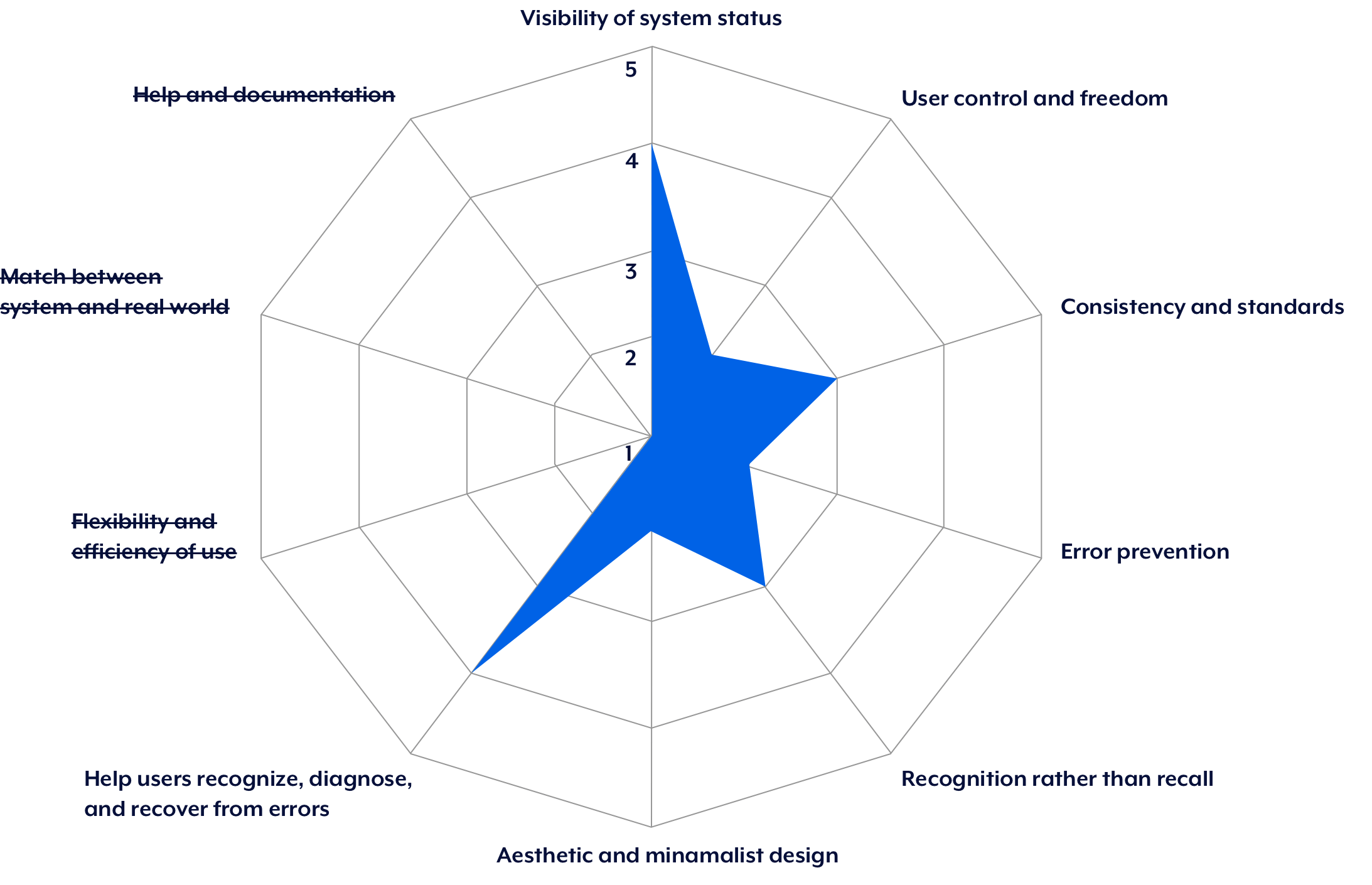
For our heuristic evaluation, we focused on seven of the 10 heuristics by J. Neilsen. These were:
- Visibility of system status
- User control and freedom
- Consistency and standards
- Error prevention
- Recognition rather than recall
- Aesthetic and minimalist design
- Help users recognize, diagnose, and recover from errors
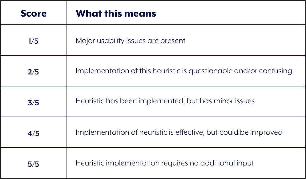
SCORING SYSTEM
Instead of using Severity Ratings for Usability Testing by Jakob Neilsen, we devised our own rating system because we felt it yielded greater flexibility (see Challenges at end of case-study). Each heuristic was given a score out of five using the rubric shown below:
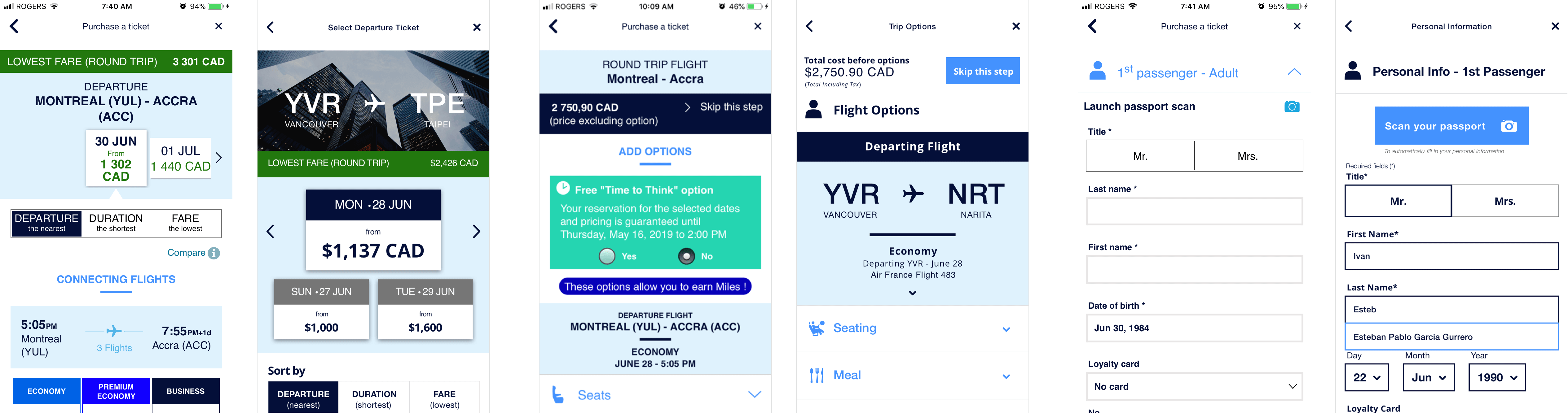
TASK FLOW
We conducted the heuristic evaluation on the Purchase a Ticket flow as we believed this was the most crucial experience to redesign in order to better serve Air France's current and potential customers.
THE EVALUATION
To conduct the heuristic evaluation, our process involved each of us going through the task flow with each heuristic in mind , and then assessing a score. We then shared our scores for each heuristic, and if we did not align in the score, we then discussed and defended our position by explaining why the score we gave was "correct" .
1) VISIBILITY OF SYSTEM STATUS
DEFINITION
The system should always keep users informed about what is going on, through appropriate feedback within reasonable time.
WHAT WORKED
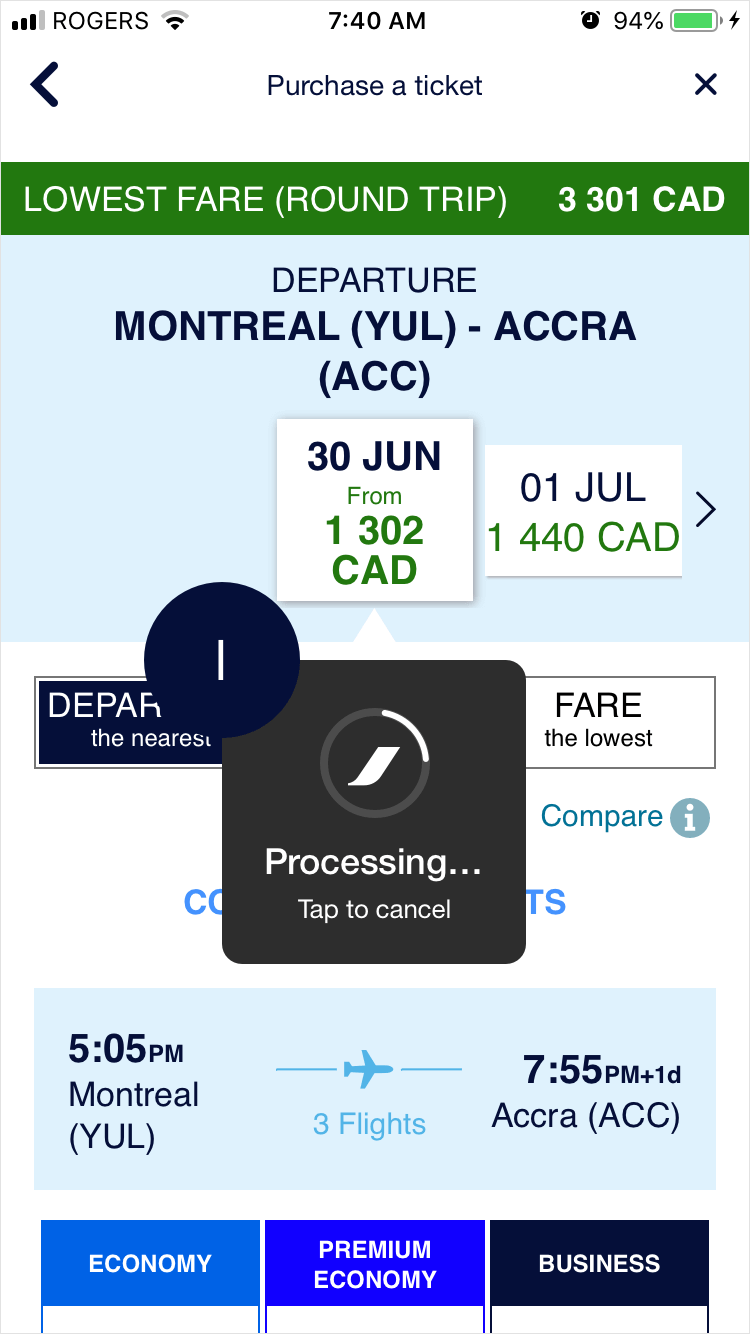
A processing system modal was present whenever there was a delay or between page transitions, which is helpful so the user doesn't think the system has frozen.
USABILITY ISSUE
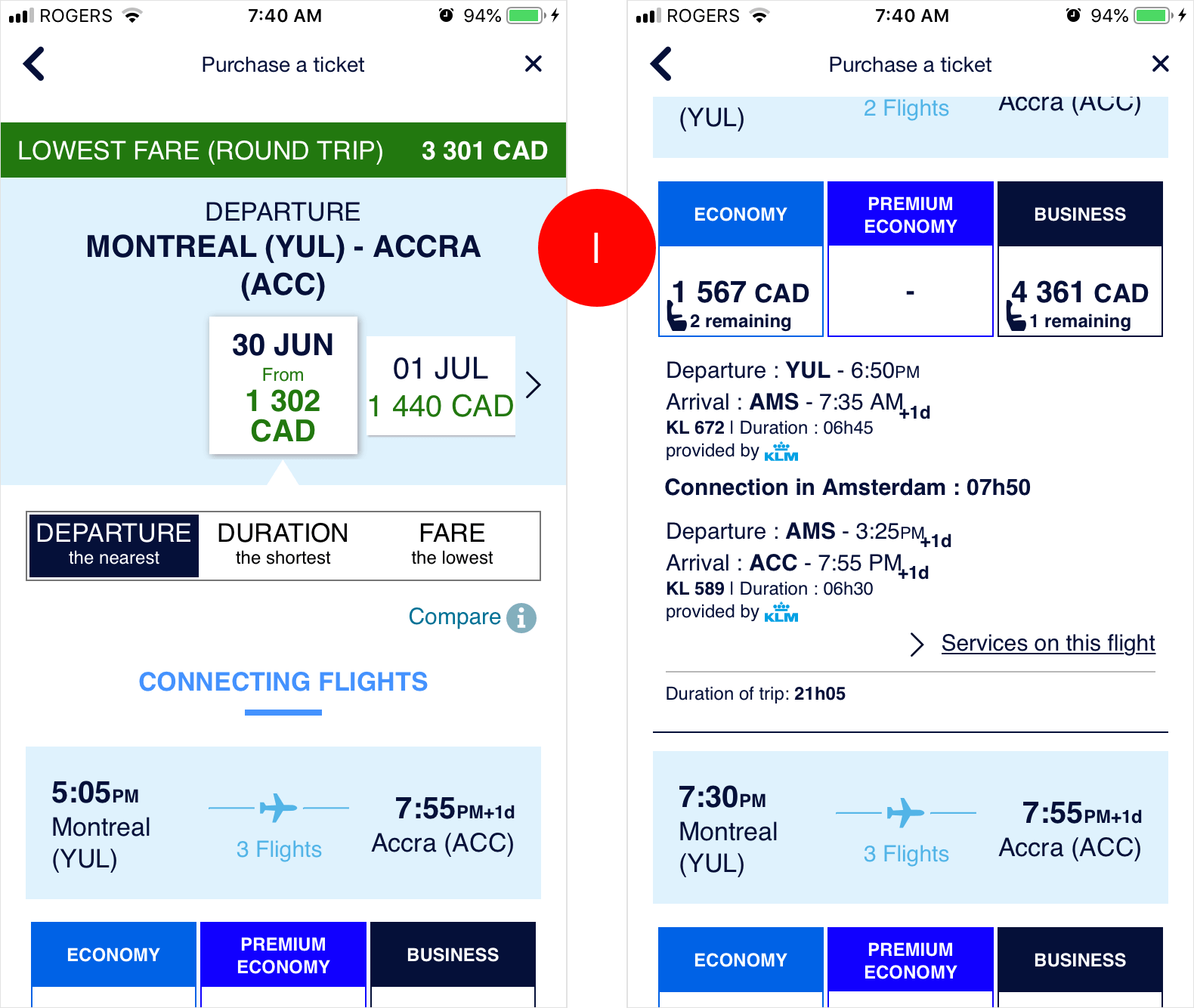
The title Purchase a Ticket is the same on all screens after tapping on Search, which is confusing for the user as to their exact location in the flow.
RECOMMENDATIONS
We recommend having more specific page titles on each screen to allow for easier localization for the user, e.g. Departure Ticket, Return Ticket, Add Options, Personal Details.
OUR SCORE
4/5
2) USER CONTROL & FREEDOM
DEFINITION
Users often make mistakes and need 'emergency exits' to leave the unwanted state.
WHAT WORKED
The user is able to exit from the Purchasing a Ticket flow, which takes them back to Buy Now.

USABILITY ISSUE #1
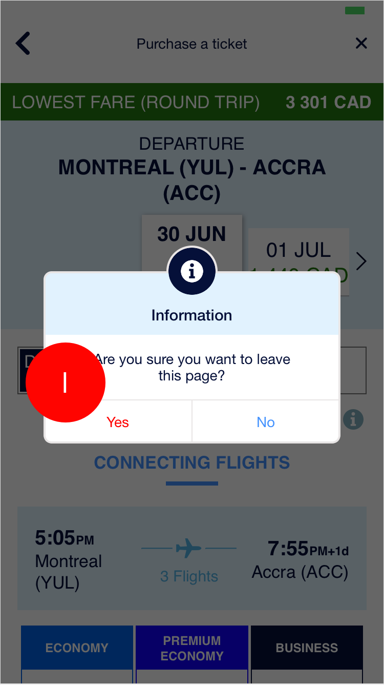
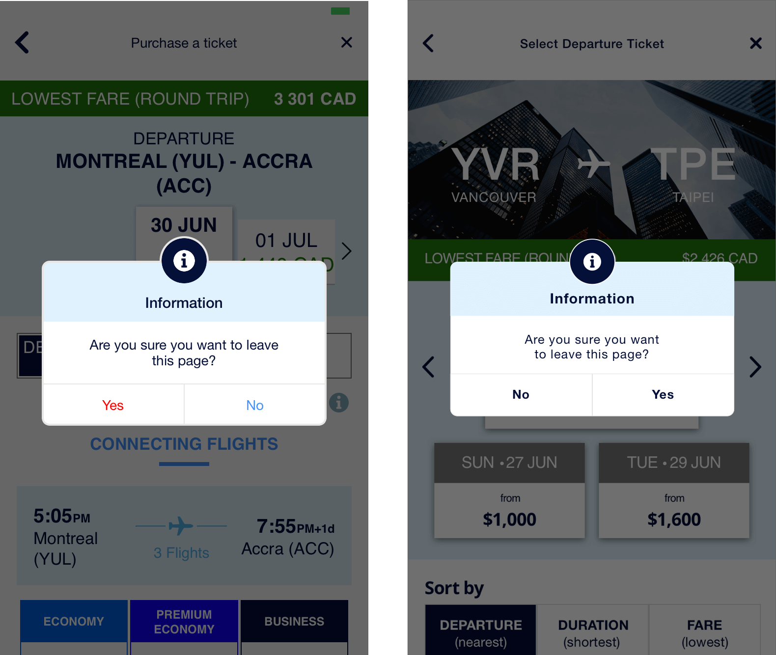
The back button on each screen does not behave consistently. In some instances it takes user back to Buy Now (the first screen of the flow), and in others, it takes them back to the previous screen.
USABILITY ISSUE #2
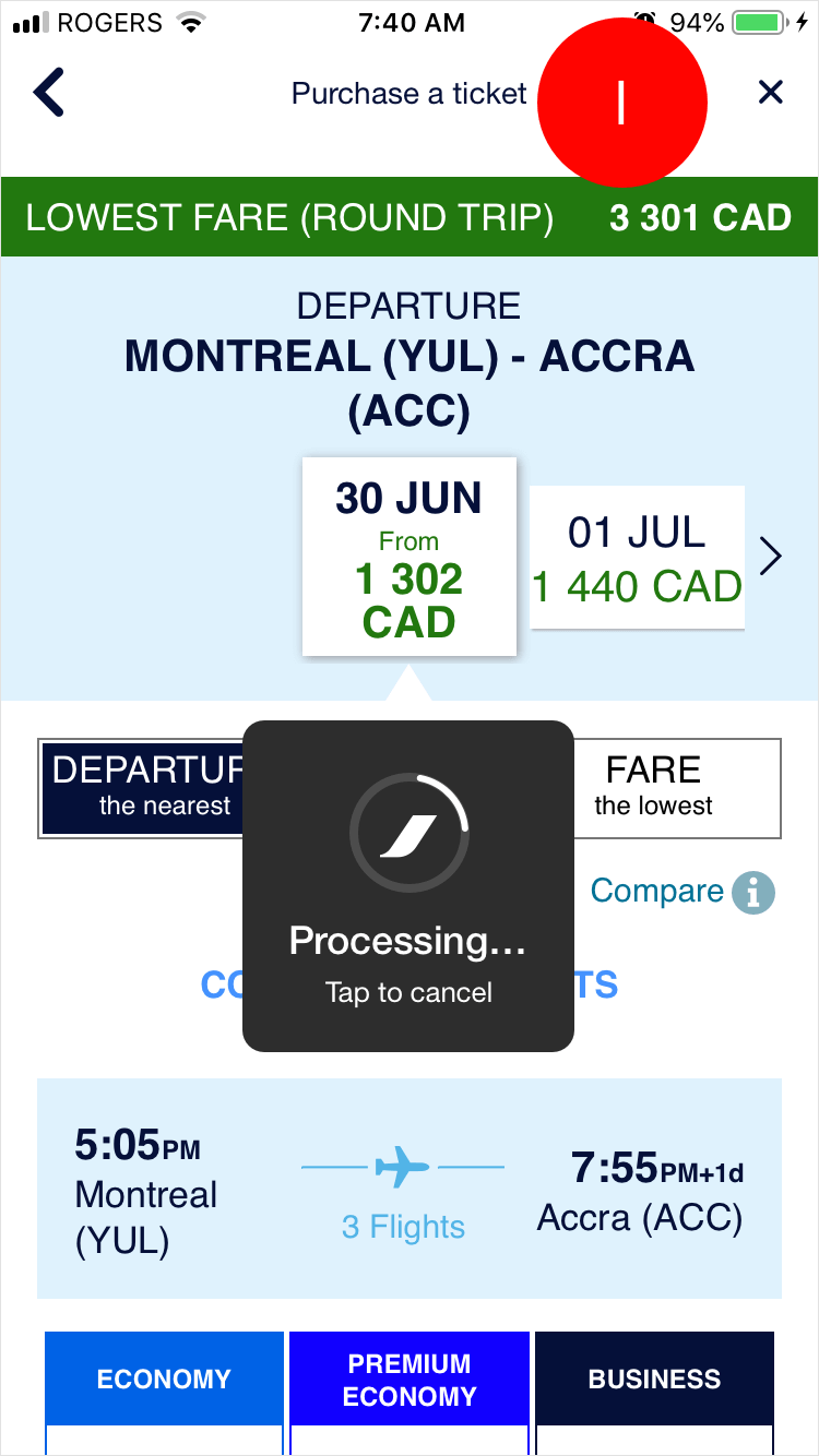
When a user taps on the processing system modal before the screen loads, it will leave them viewing a blank screen. There is no indication of what is going on, which is confusing for the user.
RECOMMENDATIONS
- We recommend that tapping the back chevron should take the user back to the previous screen every time.
- We recommend that when tapping the system processing modal, it should take the user back to the previous screen every time.
OUR SCORE
2/5
3) CONSISTENCY & STANDARDS
DEFINITION
Users shouldn't have to wonder whether different words, situations, or actions mean the same thing. Follow platform conventions.
WHAT WORKED
Icon usage for additional flight amenities are consistent with what we would expect.
USABILITY ISSUE #1
There is incorrect usage of the system error colour for the information modal options. Additionally, the positive action is placed on the left.
USABILITY ISSUE #2
The combination of the magnifying glass icon and Buy Now label is confusing as the icon typically indicates searching behaviour, but that word is not present in the label.
RECOMMENDATIONS
- We recommend that system error colours should not be used in this context and that both options should be blue. Additionally, the 'Yes' option should be placed on the right.
- We recommend changing the Buy Now label to something more descriptive such as Search Flights, Search Tickets, or Search Fares.
OUR SCORE
3/5
4) ERROR PREVENTION
DEFINITION
Prevent problems from occurring in the first place or check for them and present users with a confirmation option before they commit.
USABILITY ISSUE #1
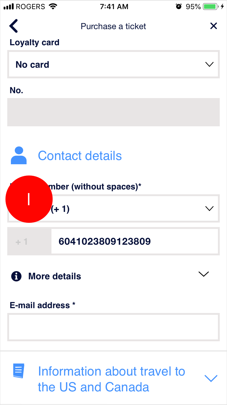
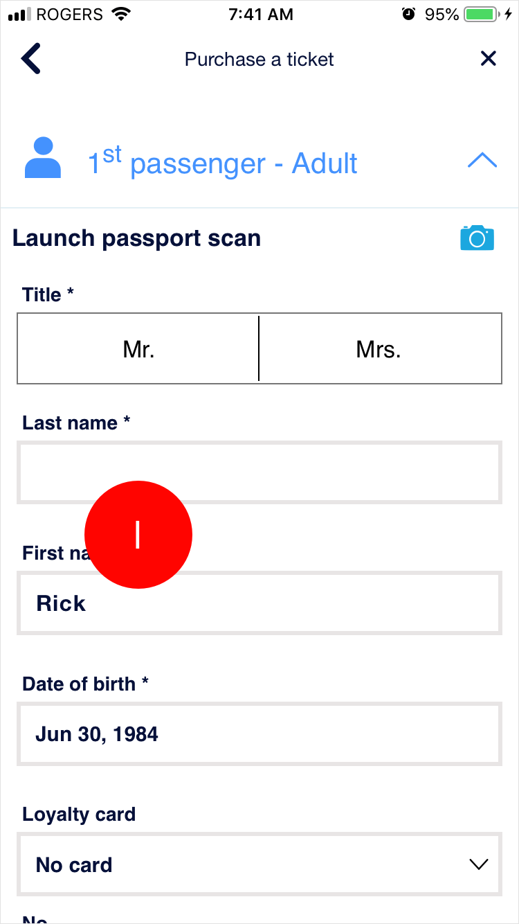
There is no dynamic error prevention on any of the relevant form fields such as phone, or e-mail.
RECOMMENDATIONS
We recommend that dynamic field validation should be provided on appropriate form-fields because it is frustrating for the user when they attempt to transmit their information, but instead receive an error notification and have to go back to the offending fields.
OUR SCORE
2/5
5) RECOGNITION RATHER THAN RECALL
DEFINITION
Minimize memory load by making objects, actions, and options visible. Instructions should be visible or easily retrievable.
WHAT WORKED
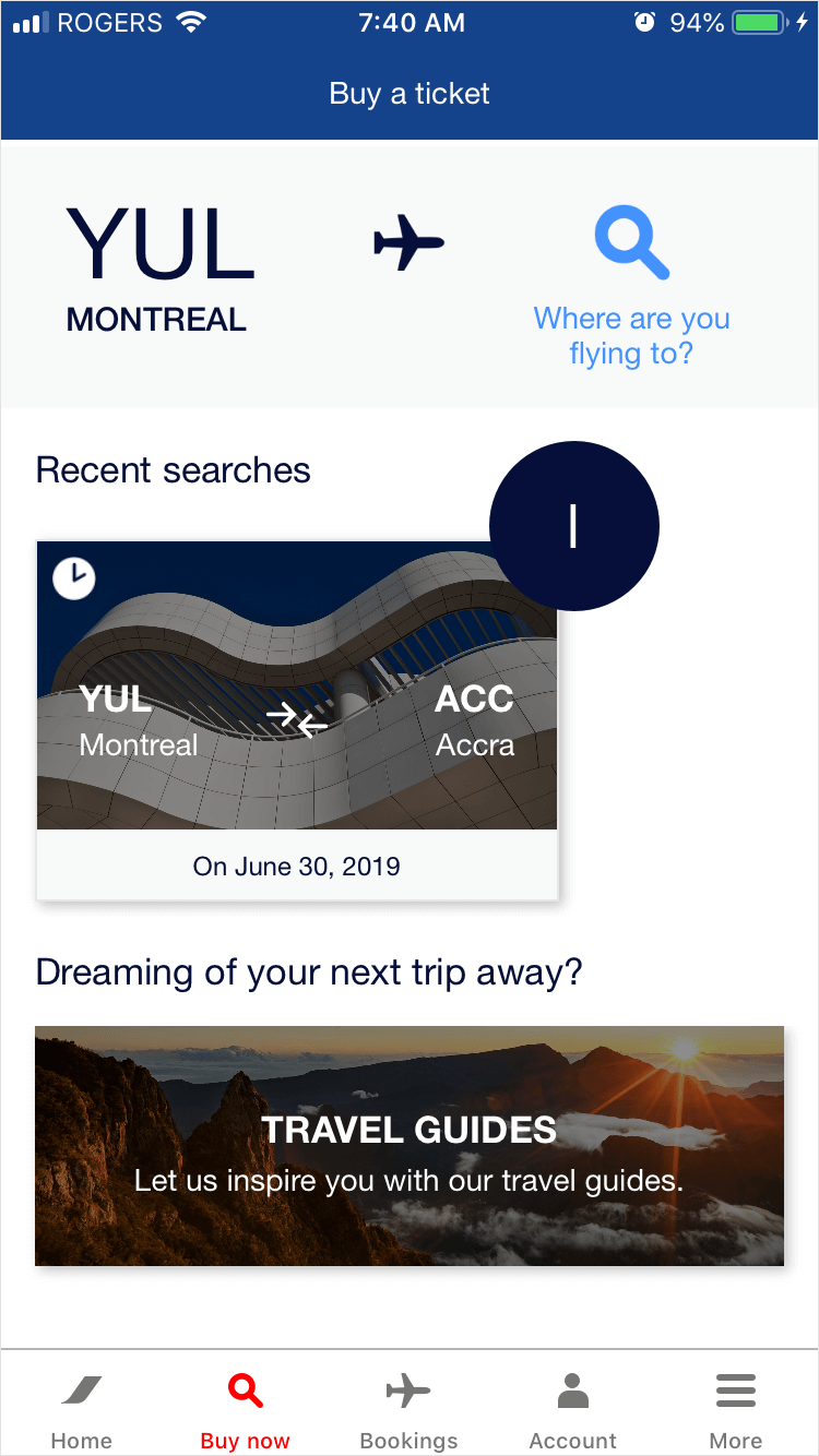
Buy Now screen shows previously searched flights, so that the same information does not have to be input again if the user is interested in looking at that particular trip again.
USABILITY ISSUE #1
Form fields do not display previously entered information when a revisiting user.
RECOMMENDATIONS
We recommend that the system should save and suggest previously entered information for ease-of-use for the user.
OUR SCORE
3/5
6) AESTHETIC & MINIMALIST DESIGN
DEFINITION
Dialogue should not contain information which is irrelevant or rarely needed.
USABILITY ISSUE #1
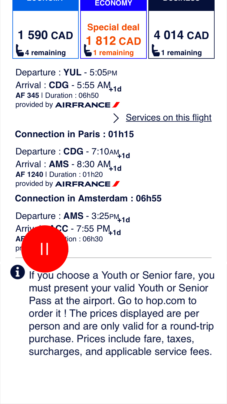
The overall design of screens is overcrowded, and it is not easy to discern what content the user should be paying attention to. There is poor use of negative space between sections and elements, poor use of colours, and poor typographical hierarchy.
USABILITY ISSUE #2
The Youth/Senior Ticket information is present at the bottom of all the ticketing screens. This means that users it applies to may miss it, and that users who it does not relate to may unnecessarily see it.
RECOMMENDATIONS
- We recommend a strong redesign for the ticketing pages. All screens after the ticketing pages will need slight redesign clean up, specifically by improving the use of negative space between elements and sections, improving the use of colours to help the user discern information, and improve typographical hierarchy.
- We recommend sending an e-mail to users that purchase Youth or Senior fares so that they are reminded of the information after the purchase has been made, instead of earlier on (which they can forget, or miss entirely).
OUR SCORE
2/5
7) HELP USERS RECOGNIZE, DIAGNOSE, AND RECOVER FROM ERRORS
DEFINITION
Error messages should be expressed in plain language, indicate the problem, and suggest a solution.
WHAT WORKED #1
The system provides a useful error message if no flight is available for specific travel dates.
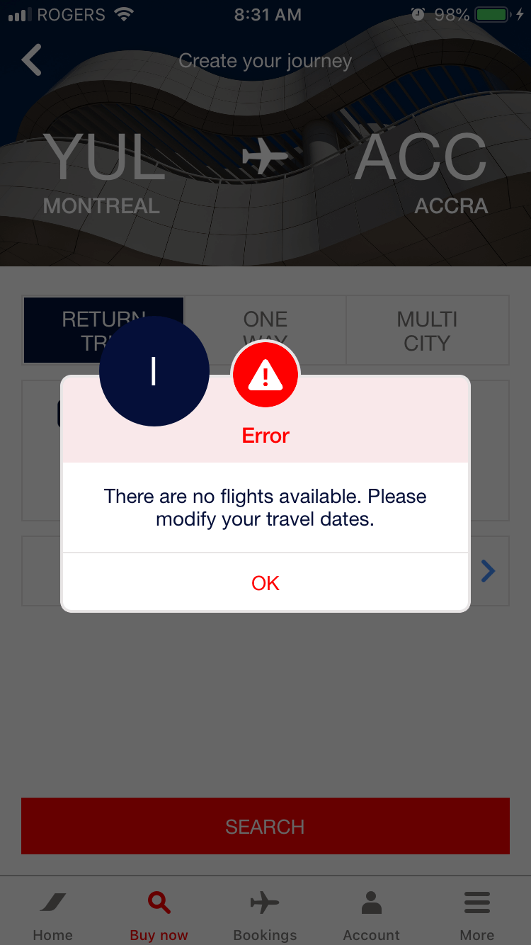
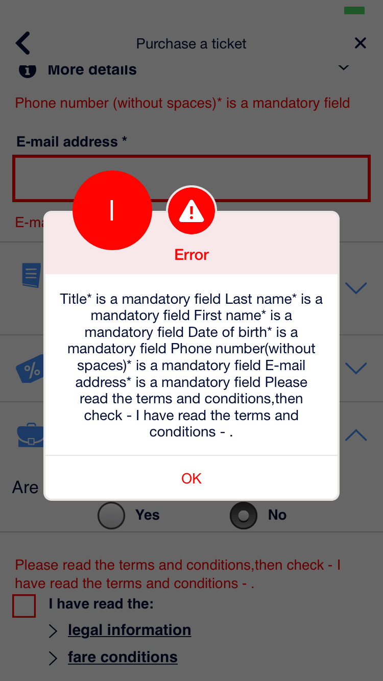
WHAT WORKED #2
The error modal shown on the personal details page is extremely hard to read as it is poorly formatted, and does not suggest how the user can rectify them.
RECOMMENDATIONS
We recommend providing a better-organized error modal to reduce the cognitive load on the user when they need to rectify their mistakes.
OUR SCORE
4/5
SUMMARY
Our heuristic evaluation provided the purchase a ticket flow with a total score of 21/35. While our evaluation revealed that there were no disastrous usability issues for a user when attempting to purchase a ticket, there was a lot of room for improvement to make the flow more usable, and a better overall experience.
EXPERIENCE REDESIGN
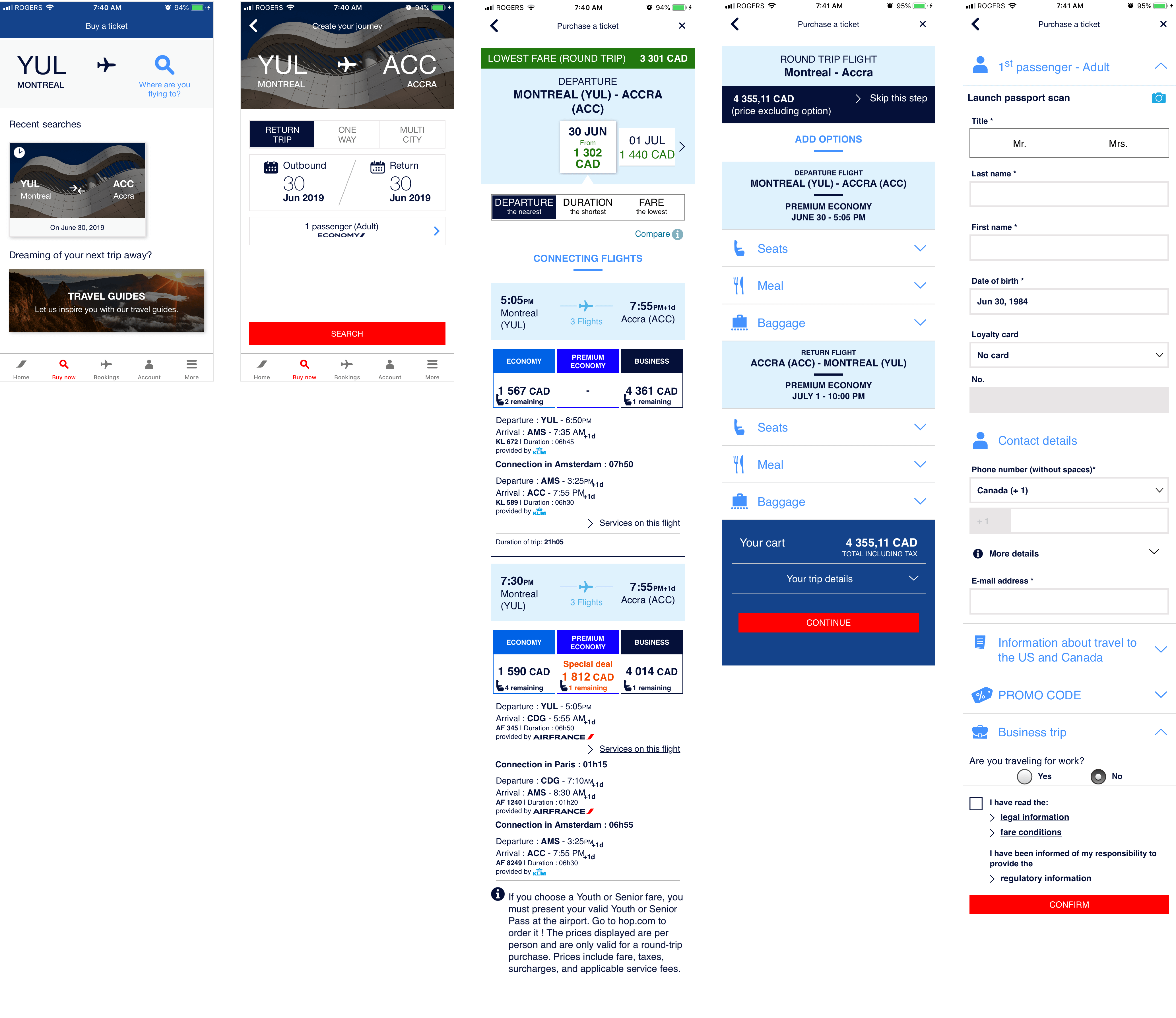
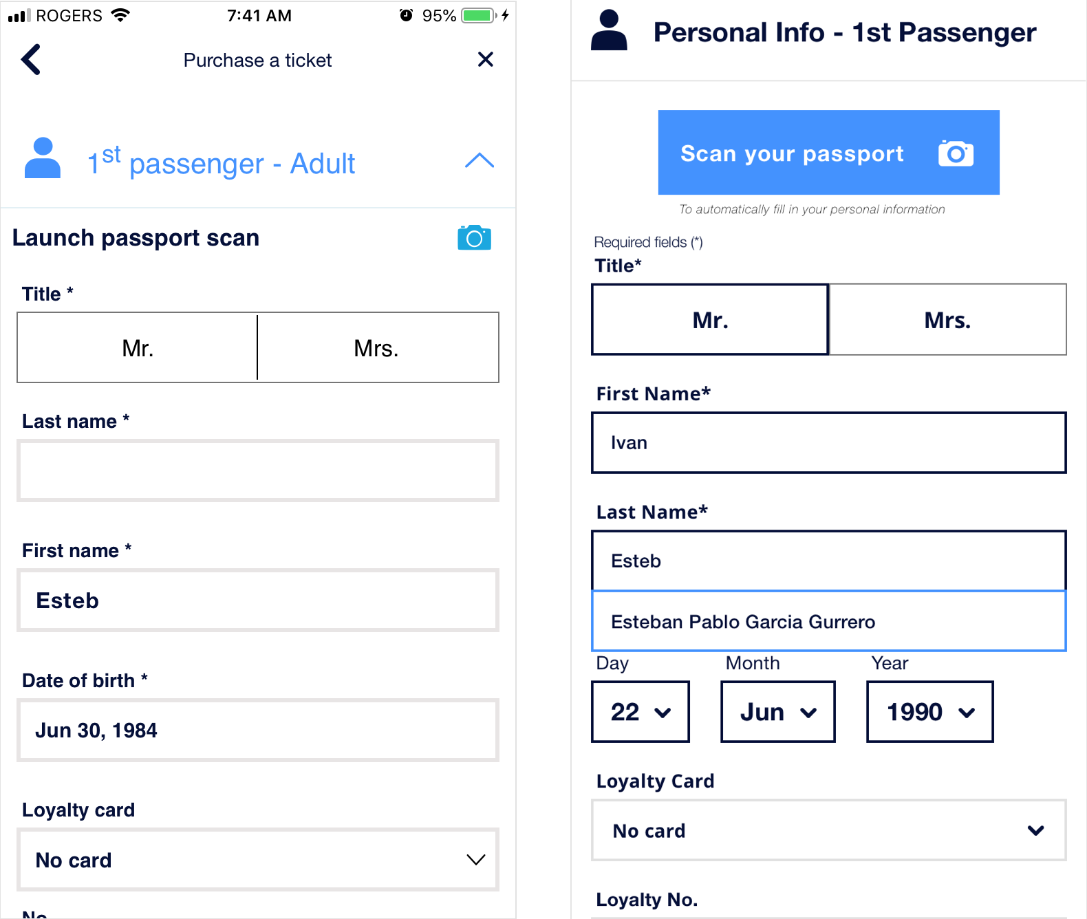
The redesigned screens were based off of the recommendations that we had made during the Heuristic Evaluation. Going into the redesign, we anticipated that the largest visual overhaul would be required on the Select Departure Ticket; Trip Options would also require some effort to redesign visually; the Personal Information screen would look very similar, but have usability and visual improvements.
1) VISIBILITY OF SYSTEM STATUS
In the previous experience (left screen for each pair), all screens were titled Purchase a Ticket which made it confusing for the visitor to orient themselves in the ticket purchase flow. In the redesigned experience, we changed the title to be more descriptive, such as Select Departure Ticket, Trip Options, and Personal Information, to improve the experience.
2) USER CONTROL & FREEDOM
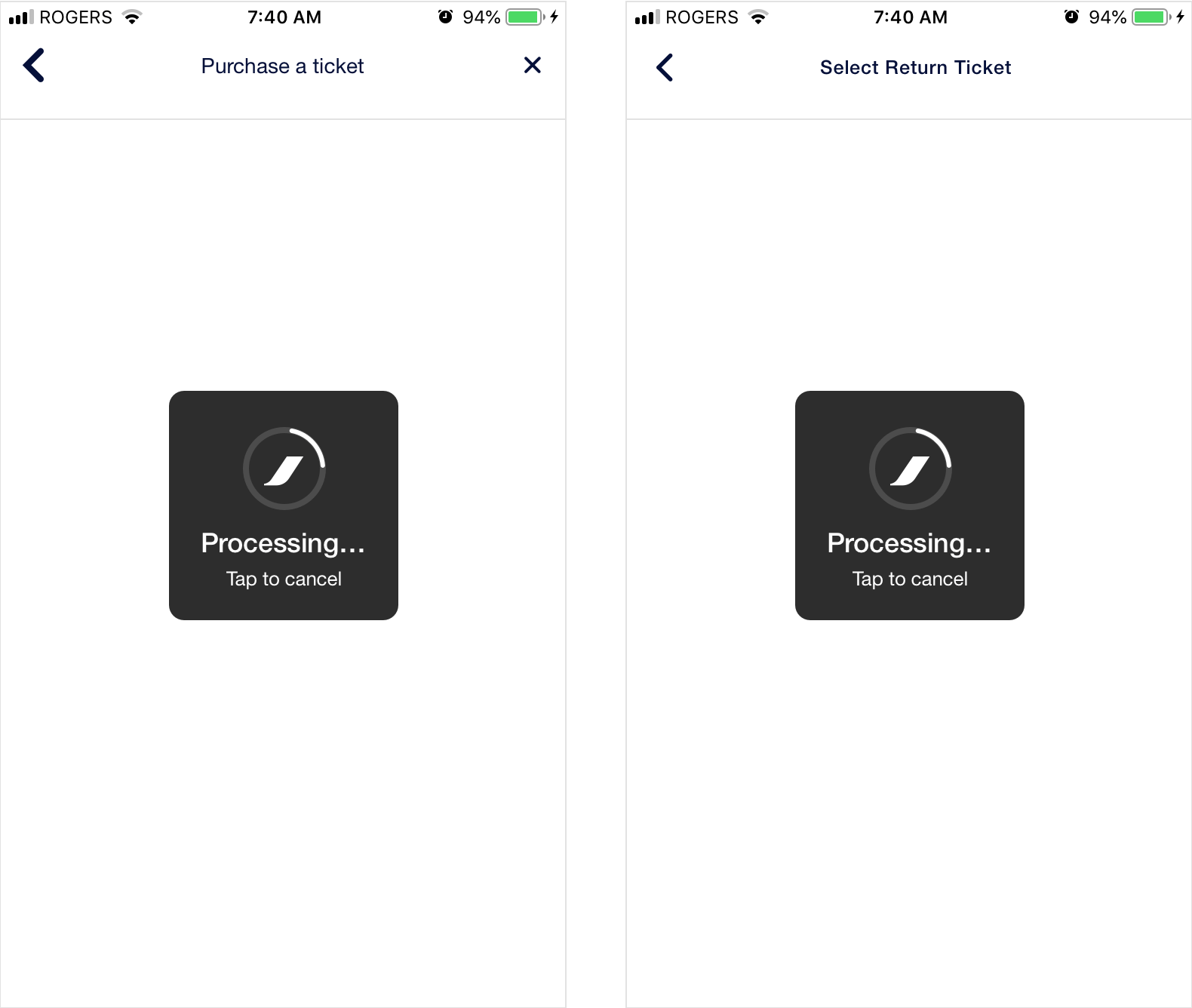
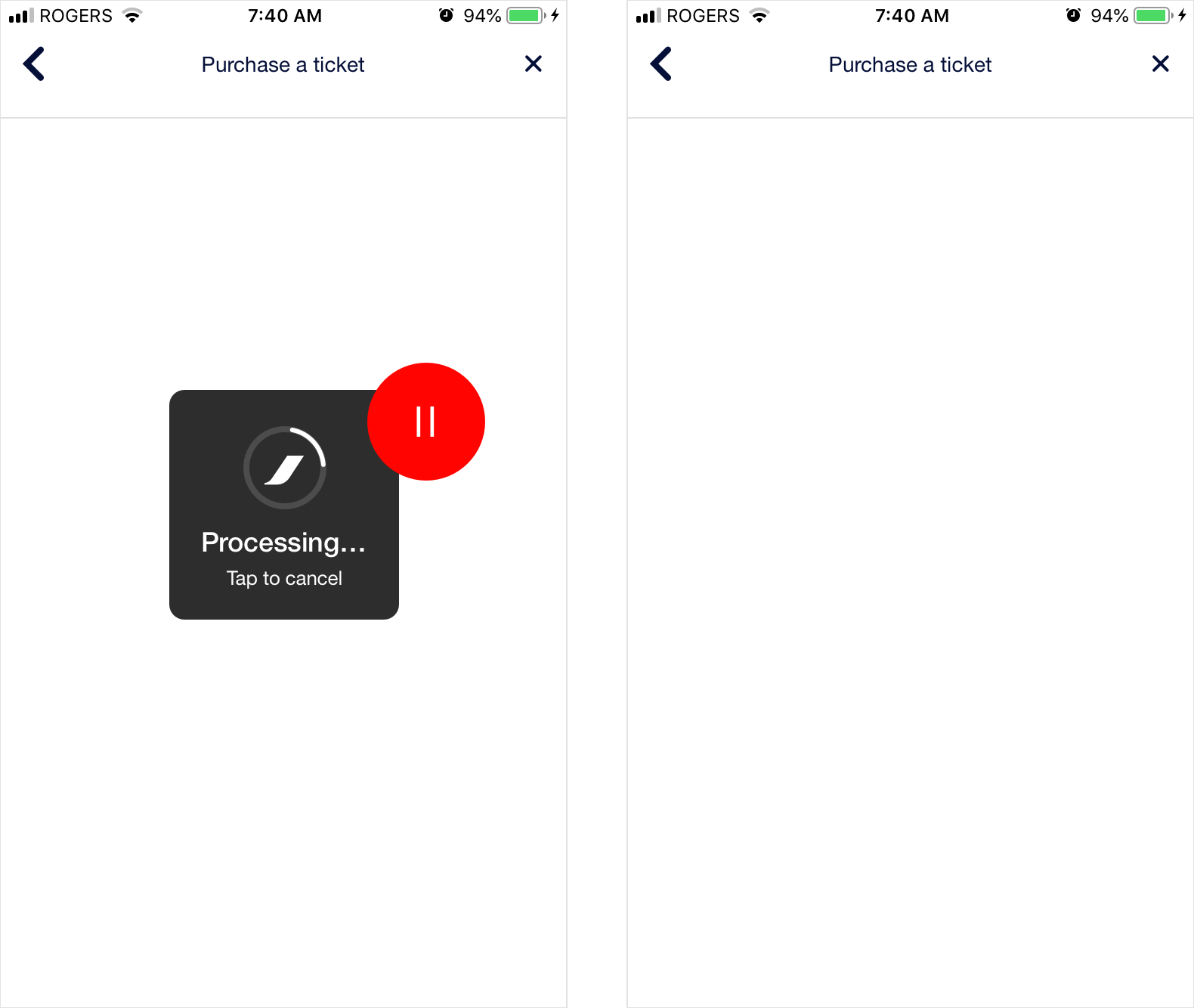
In the previous experience, tapping Tap to Cancel (left screen) would stop all requests and leave users waiting for something to happen on an blank screen if they cancelled before content had loaded. To improve the experience, tapping the modal should always take the user back to the previous screen by preventing a "dead" page. Notice the microcopy change too.
Another issue regarding this heuristic was that in the previous experience, tapping the back chevron in the navbar would behave inconsistently. Sometimes it would take the user all the way back to Buy Now, and othertimes it would take the user back to the previous screen. To improve the experience, tapping the back button should always take the user back to the previous screen.
3) CONSISTENCY & STANDARDS
In the previous experience, the positive action was placed on the left, and the system error colour was used in an incorrect manner to highlight it. To improve the experience, the positive action is placed on the right, and the font colour is changed to dark blue as it is not an error.
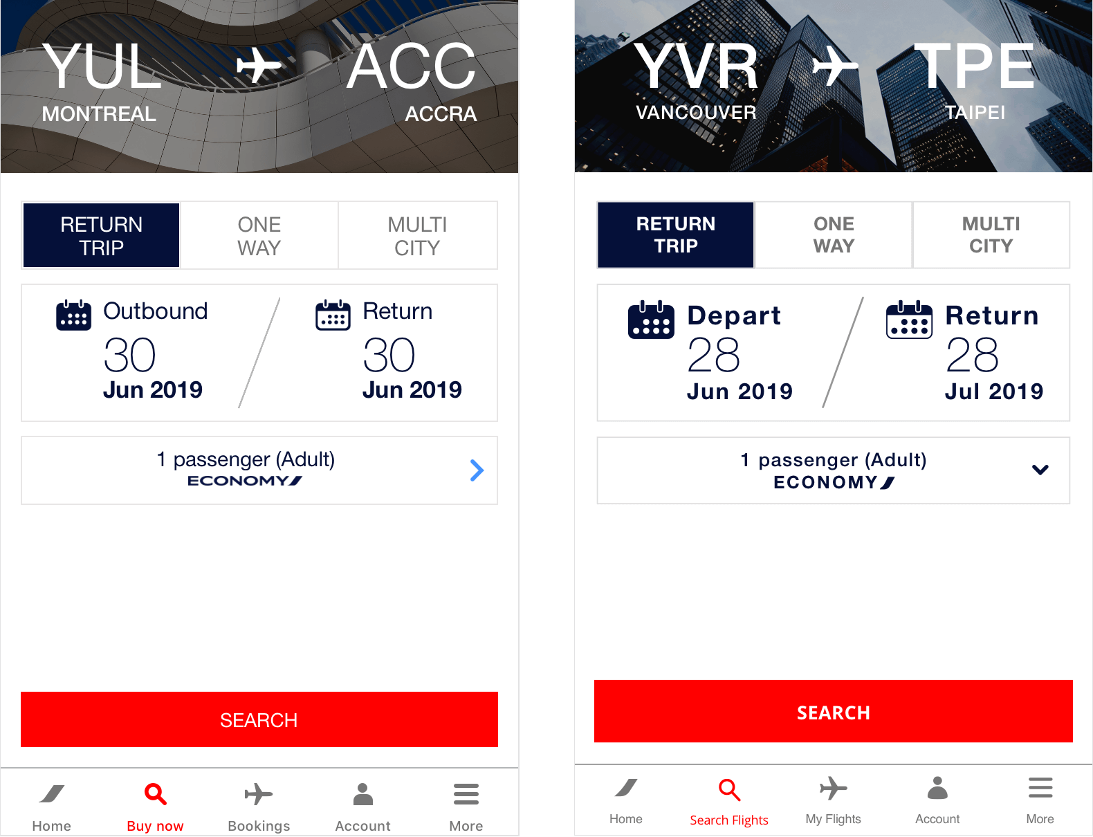
In the previous experience, the Buy Now label paired with the magnifying glass icon to represent searching for tickets could be made more clear. To improve the experience, we changed the label say Search Flights instead, which is more a more accurate indication of what the user will be doing.
4) ERROR PREVENTION
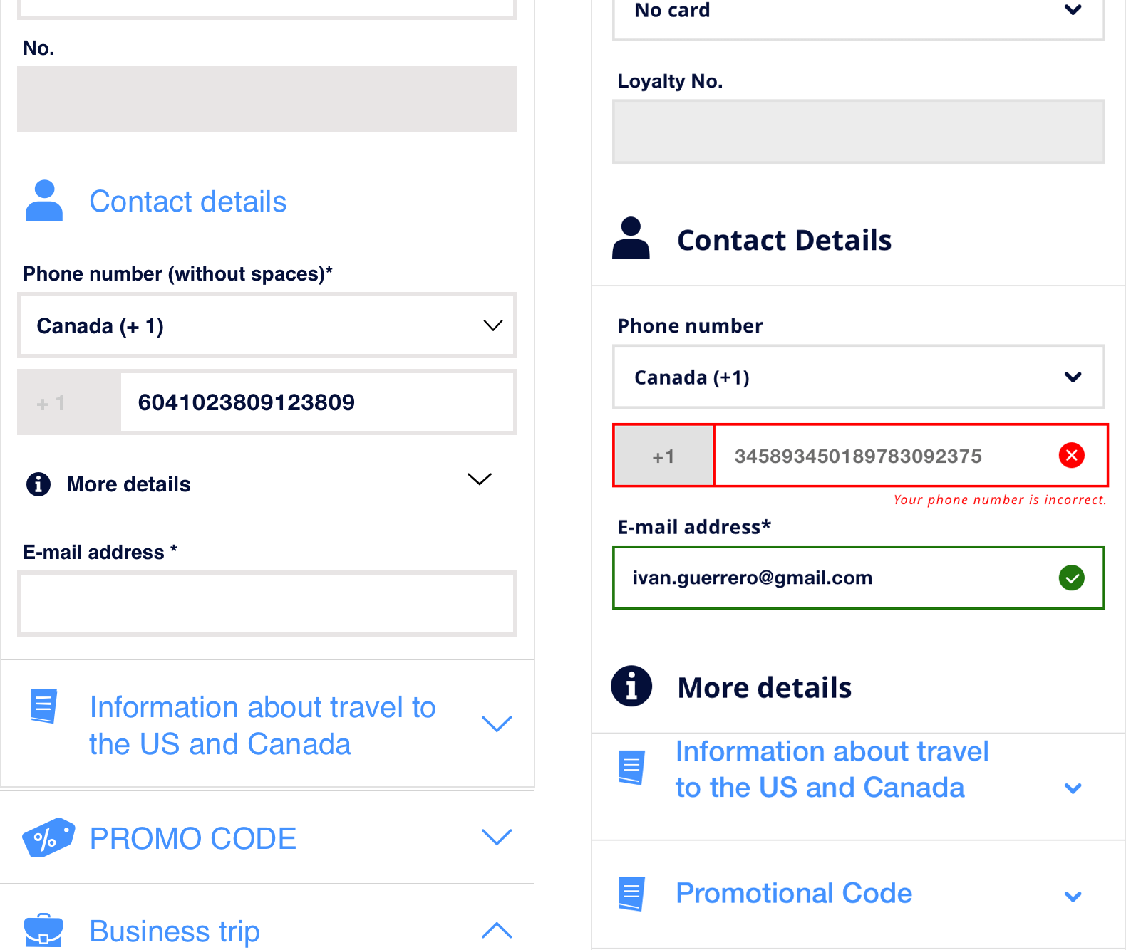
In the previous experience, there was no dynamic error validation when users entered their information into the phone number or e-mail address form fields. The only time the user would discover if there was an error was after they attempted to submit their information, after which they would receive a notification that there was a mistake and then have to scroll to those fields to correct them. To improve this experience, the user is informed if their entry is valid/invalid a short time after they have stopped entering information into that field so that they don't have to experience the hassle of the previous experience.
5) RECOGNITION RATHER THAN RECALL
In the previous experience as a non-registered user, if we filled out information in a form-field, left the screen, and then started entering that same information again, previously entered information was not suggested in a dropdown, and had be typed out again which is extremely tedious. To improve this, we added a suggestions dropdown that would trigger on a user entering their information in a previously filled out form-field.
6) AESTHETIC & MINIMALIST DESIGN
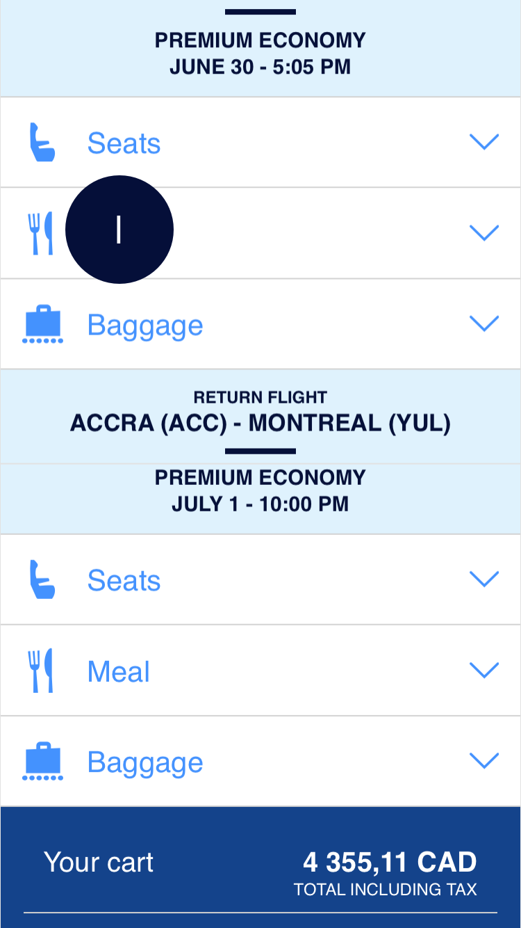
In the previous experience, almost all screens had extremely poor UI. There was a lack of hierarchy, poor use of typography, elements were overflowing out of their bounds (could be considered more of a dev issue), not enough padding between elements, poor use of colours, and not enough negative space between sections. To improve this, you can see that all the screens got a revamp to improve it (with ticketing getting the largest overhaul), and make navigating through the purchasing a ticket experience much more pleasurable.
7) HELP USERS RECOGNIZE, DIAGNOSE, AND RECOVER FROM ERRORS
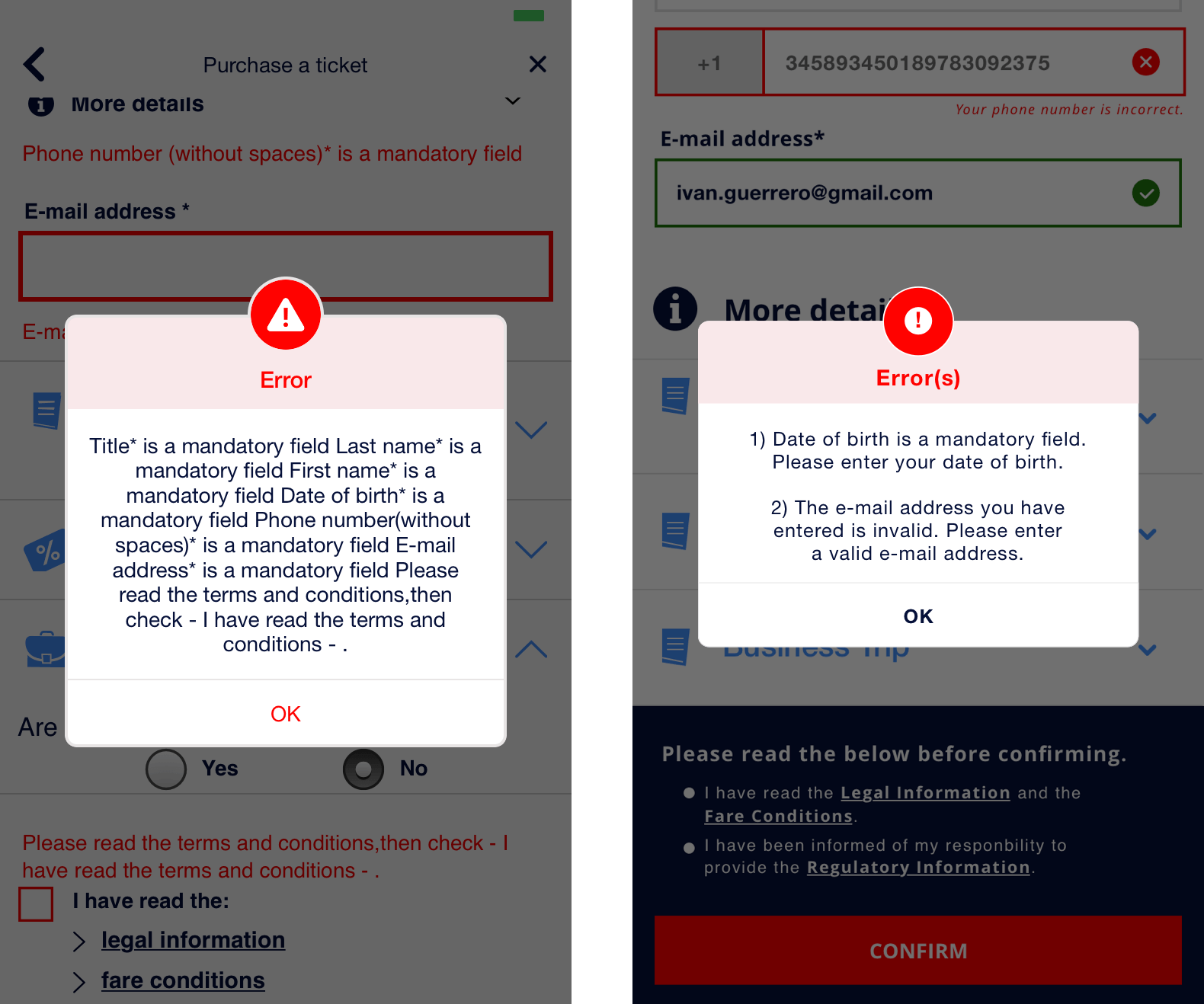
In the previous experience, the error messages were poorly formatted which made it very difficult to parse which fields needed to be corrected, and what the correct steps were to do so. To improve this, we numbered the error messages in list format, and made sure to add how the user could rectify the issues (even though it seems pretty obvious) to reduce the cognitive load.
WHO WORKED ON WHAT?
During the redesign phase, my focus was on overhauling Select Departure Ticket whilst my partner focused on redesigning the two screens that came after ticket selection, Trip Options and Personal Details.
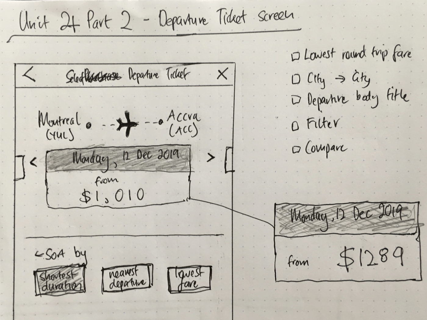
Initially, I looked at other designs for ideas as to what the ticket selection screen could look like (see Inspiration) and started sketching ideas that resembled the current Air France experience with some features from the inspiration. The rationale behind this was that if the interface was similar to the previous experience, then users that used the app more regularly would be able to navigate in a familiar, but enhanced manner.
If you would like to compare the current and redesigned experience, feel free to view the current, and redesigned experience.
PROJECT TAKEAWAYS
CONCLUSION
It is very surprising to me that an organization as large as Air France has a mobile app currently in the state it is. I believe this case-study demonstrates the importance of conducting a heuristics evaluation on on an existing flow/app/service/product, as it exposes many usabilities issues that result in a tremendously poor experience—an experience that visitors are currently having right now as you read this (c. July 2019).
To be honest, I feel that many of these design issues should have been identified and fixed pre-development as it will be much more be costly to fix now, but hey, we wouldn't have been able to do this case-study if it wasn't for these issues.
CHALLENGES & LEARNINGS
Reflecting on this project, I feel there were a few hurdles that we experienced while conducting the heuristic evaluation and redesign, specifically:
- Custom scoring system
- Lack of experience as usability evaluators
CUSTOM SCORING SYSTEM
Initially, our reasoning was to use our own custom scoring system instead of the Severity Ratings for Usability Testing because we thought that more flexibility would make the process easier. However, due to what I consider the rather subjective nature of a heuristics evaluation (or perhaps it's just because I'm a novice evaluator), the added flexibility actually made it harder to provide a usability score for each heuristic as the lines were between scores were blurred. Additionally, our scoring system did not have the fidelity with which to prioritize the fixing of usability issues (present in the Nielsen severity ratings), which would have been helpful going into the redesign phase due to time-constraints.
In the future, if I was to perform a heuristic evaluation again, I would likely use the Nielsen severity ratings as the foundation complemented with further explanation and examples of each of the terms used, such as 'Usability catastrophe' and 'Major/Minor usability issue'. This would, therefore, give more stringent guidelines for multiple evaluators to reach a consensus and leave less room for subjectivity.
LACK OF EXPERIENCE AS USABILITY EVALUATORS
I felt that going through this evaluation process seemed quite open-ended when assessing each heuristic. As novice evaluators, we could kind of make sense of what each heuristic definition was trying to get at, but I feel a more specific set of guiding questions would have been really beneficial for us. For example, as I was writing this case-study, I started researching how other heuristic evaluations were conducted. I found this article, Heuristic analysis of yuppiechef where the author uses 2-3 guiding questions in order to evaluate each heuristic.
For example, the definition for Error Prevention is, "Prevent problems from occurring in the first place or check for them and present users with a confirmation option before they commit" and the guiding set of questions used in her analysis were,
- Are there helpful constraints that prevent the user from making mistakes?
- Is the user guide with suggestions to prevent incorrect actions?
- Is the user presented with forgiving formatting for information?
In the future, if I was to perform a heuristic evaluation again, I'd make sure to use a guided set of questions like this in order to provide specificity and direction of the heuristic evaluation, which would ensure that all evaluators are on the same page and leave less room for subjectivity.
CLOSING WORDS
If you made it this far, thank you for taking the time to go through (or skim) this project. If anyone has any feedback for me regarding anything on this project, please feel free to get in touch with me.
Thank you!