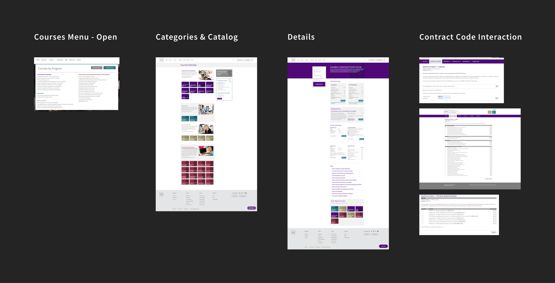
IFSE
Purchase Flow Redesign
THE CHALLENGE
How might we improve the experience of purchasing financial training courses for IFSE's users?
Scope
There were two main goals of the redesign: 1) Improve the course purchase experience for all users so that more than one course can be purchased a time, and 2) Improve the experience for bank employees that will select products and sub-products after entering in a contract code that provides them with bundled course discounts.
Solution
By leveraging UX / UI design from large e-commerce and e-learning companies (e.g. Best Buy, Coursera), the IFSE purchase experience is more intuitive and familiar for all users and most importantly, allows multiple courses to be purchased at once. Additionally, bank employees can now input the contract code from more touchpoints on the website and the interactions for adding courses and sub-products is easier than before.
Impact & Outcomes
The final deliverable were low-fidelity wireframes which were handed to Lambda Solutions to deliver to the IFSE's internal team to review. Currently, no further work has been done on my part and the IFSE still currently use their legacy experience.
Role
- UX Design
Tools
- Sketch
- InVision
DISCOVERY
Understanding the goals and objectives
I met with the Director of Learning Solutions (DLS) of Lambda Solutions to understand more about the project that they had been commissioned with. From my discovery session, I learned that there were two main goals of the redesign:
- To improve the IFSE course purchase experience so that more than one course could be purchased a time
- To improve the experience for bank employees that will select products and sub-products after entering in a contract code that gives them bundled course discounts.
Understanding the minimum requirements
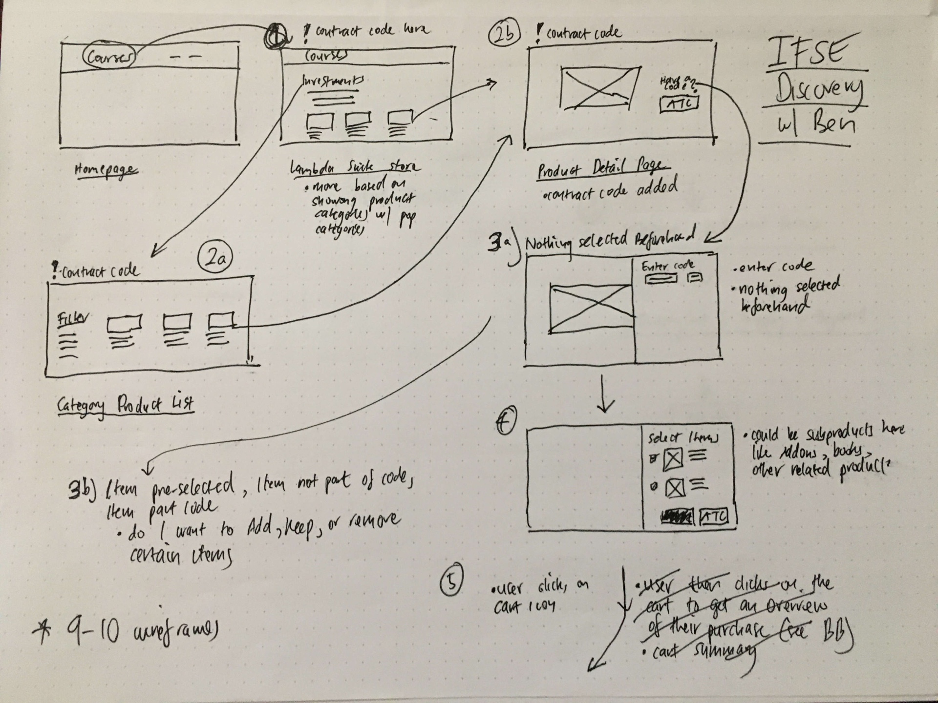
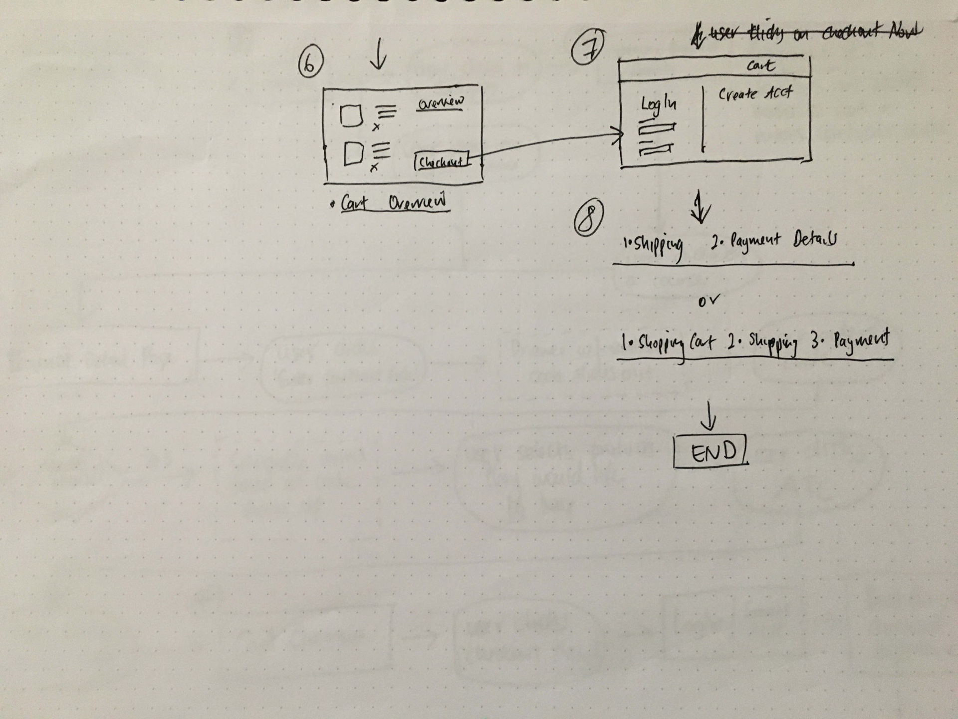
To understand more about the experience that I was going to design for, I sketched a user flow diagram with the DLS to see the different ways a user could navigate from the Courses page all the way through to checkout. Once this preliminary user flow was approved, I was then provided with user stories, acceptance criteria, and a workflow diagram (with minimum requirements) in order to start the redesign.
REDESIGN PROCESS
Discovering e-commerce/e-learning trends and patterns
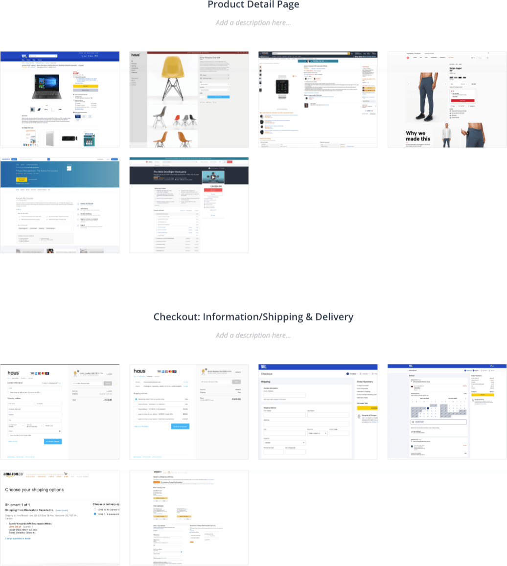
Initially, I researched and analyzed how large e-commerce/e-learning businesses (e.g. Amazon, BestBuy, Shopify, Coursera, Udemy) designed their experiences for product navigation, product category pages, the display of multiple products, the product detail page, interactions (e.g. when items are ATC), as well as the entire checkout flow.
Designing the contract code interactions
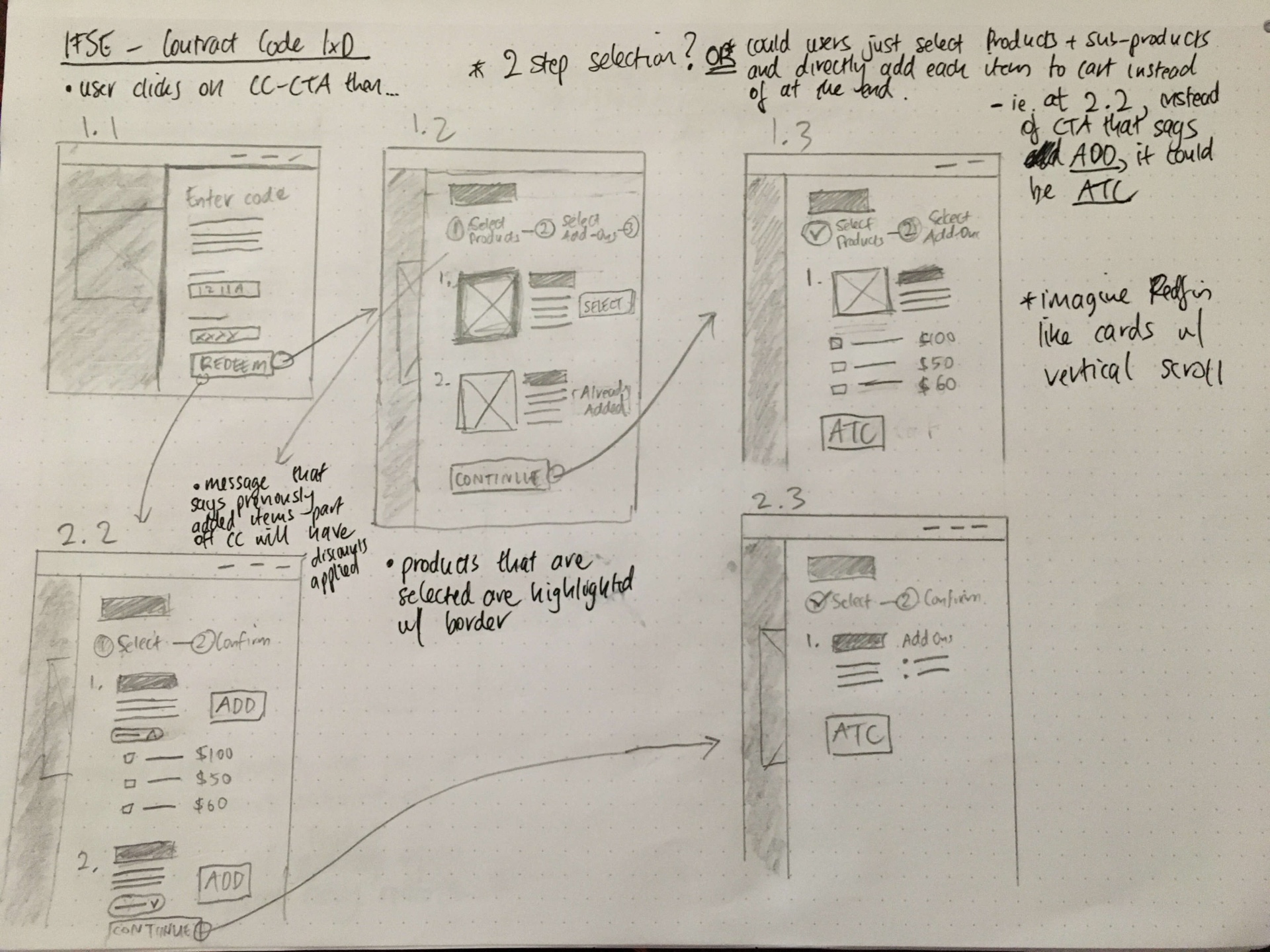
The IFSE wanted to ensure that bank employees could enter in a contract code at multiple touchpoints on their website and from the design side of things, this was rather straight-forward (see redesign) - CTAs. What was challenging was figuring out what the most intuitive experience for bank employees when they clicked on this CTA as no user testing was conducted.
For example, some considerations were:
- Should clicking the CTA take a user to a dedicated page or have a drawer slide out in order for them to select products and add-ons?
- How do we let the user know that an item that's part of the contract code was already previously added to cart?
- What would the most intuitive way for a user be to select/add courses and add-ons? i.e. Should there be one stage where a user selects the course and add-ons immediately or multiple stages where courses are selected in the first stage and then add-ons selected during the next stage?
THE REDESIGN
A modern, purchase and checkout experience
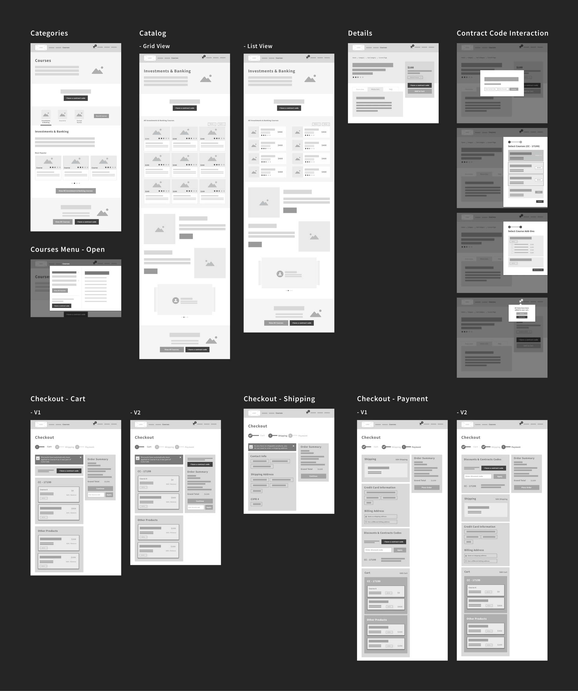
After doing two revisions of the wireframes, the lo-fidelity wireframes below was the final deliverable delivered to be reviewed by the IFSE. The redesigned experience captures all the minimum requirements requested with the most important aspects of the redesign being:
- The omnipresence of the "I have a contract code" CTA that allows bank employees to enter a code to purchase courses at a discounted rate
- The contract code interactions that allows bank employees to add courses and sub-products from most pages on their website.
You'll also notice that the screens also resemble large e-commerce sites with respect to components, content sections, and layout, which means that users will find the experience improved due to increased usability and intuitiveness.

